Epomaker Tide 75 Review
In the few short months I’ve been going bananas reviewing keyboards, the offerings I’ve tested from Epomaker have gone from “meh”, all the way up to “oh wow!” The “oh wow” was the Epomaker x Feker Galaxy 80, by the way, an entry-level mech keyboard I absolutely cannot get enough of. The “meh” was the Shadow X, the TH80 Pro, and the Shadow S- keyboards which are all perfectly competent but don’t make me feel quite how the Galaxy 80 or KiiBOOMs ridiculous offerings do.
Where does the Tide 75 rate on this scale? Well I chose to review the very chic black and gold version and I’m happy to report that it’s notched past “oh wow!” and thoroughly into the realms of “daaanng!”
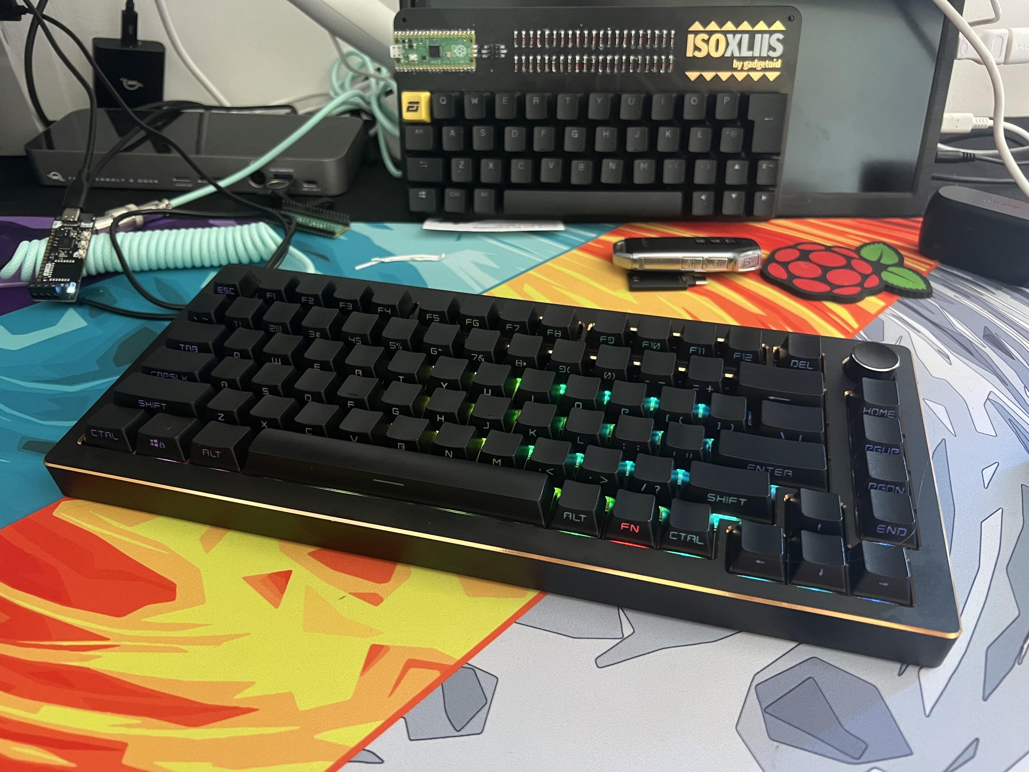
The Epomaker Tide75 with front labelling and the glorious CTAL key!
The Tide 75 isn’t perfect, mind, but it represents something I’ve wanted from the likes of Epomaker since I first (not that long ago) fell deep into the rabbit hole of artisanal mechanical keyboards. That something is “shiny, but cheap.”
While I can very easily understand the allure of expensive, low volume, exclusive mechanical keyboards with exquisitely designed aluminium enclosures dressed in buzzwords and finished with a dozen different ways, they are- unfortunately- far, far beyond my means. I want a toe in the game, and I want to feel special for a fraction of the cost. Epomaker’s Tide 75 absolutely delivers on this.
The Tide 75 in black… especially so.
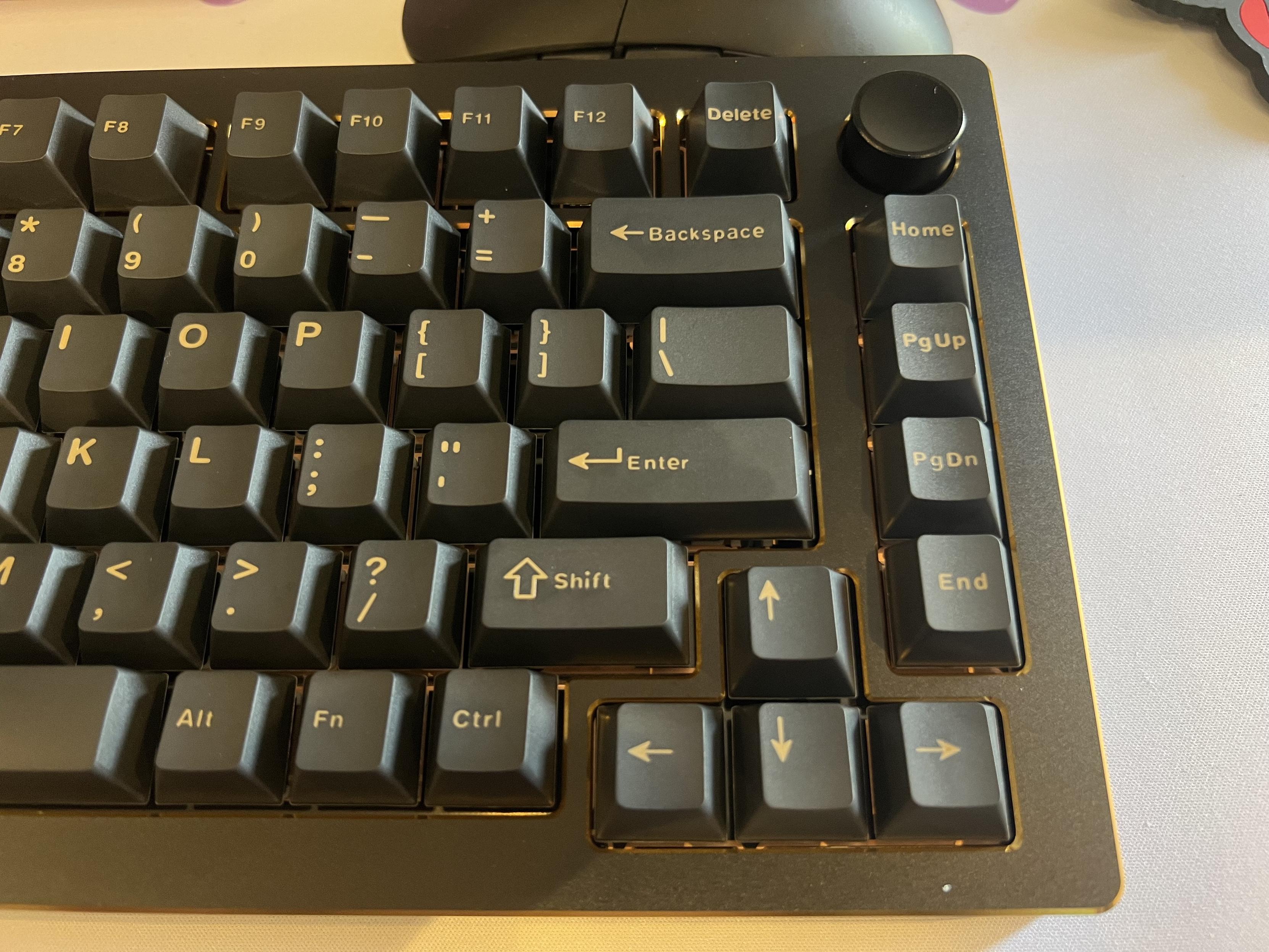
Look, I’m a sucker for the silly details and it doesn’t take all that much to elevate a keyboard from “meh” to “wow” for me. In the case of the Tide 75 it was simple- an all-aluminium enclosure, consistent, clean key labelling and – on the black version at least – a gold-accented chamfer that lifts an otherwise very plain looking board to an absolute chef’s kiss of style.
I’m very conflicted about the font, and it would be nice if the knob chamfer was also picked out in shiny shiny gold.
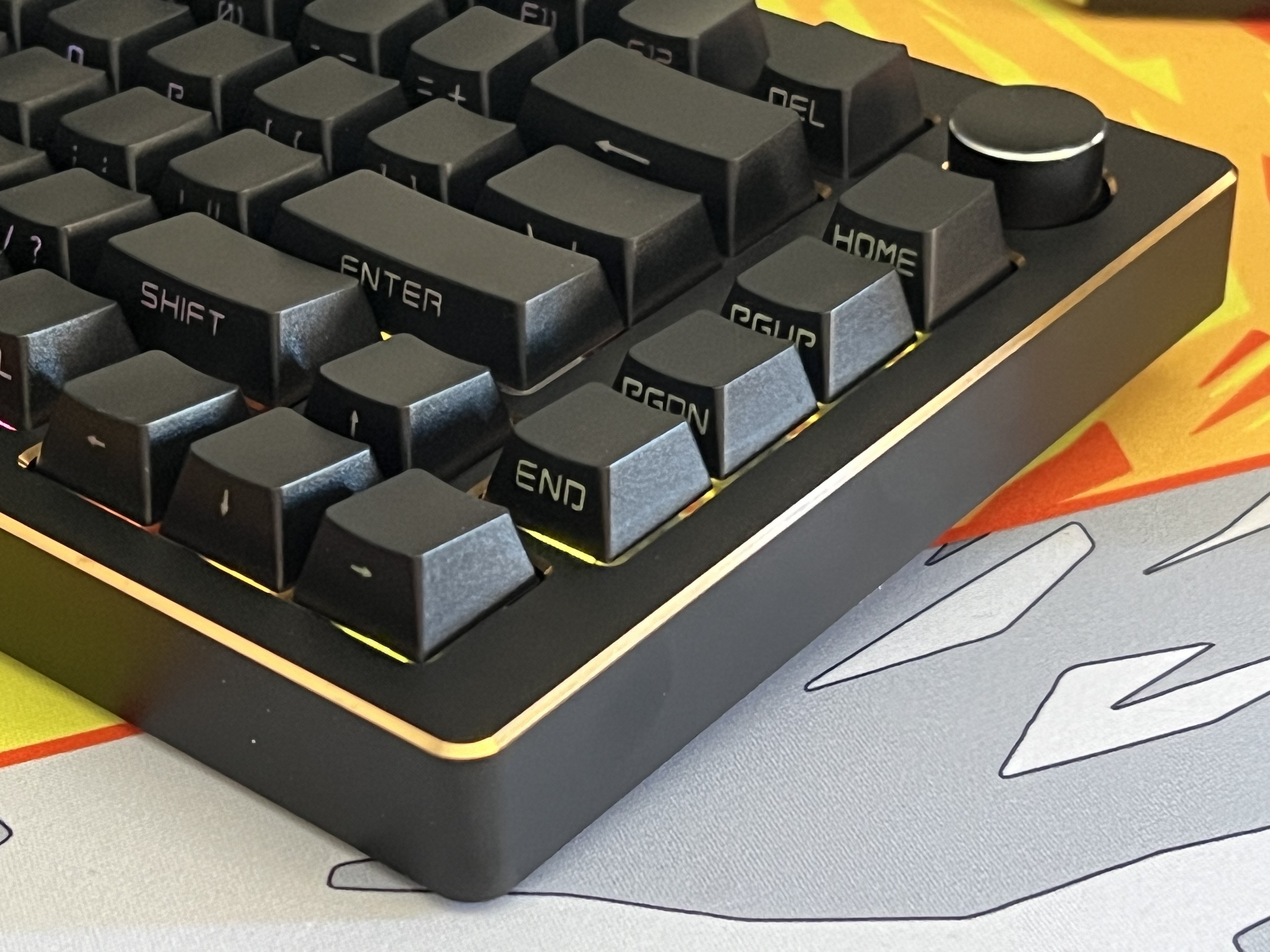
Of course it would be fitting for me to be drawn in by the allure of black and gold, since it’s been our house style for PCBs for over a decade at Pimoroni (well purple PiGlow and Pibrella notwithstanding) and it’s truly a timeless, impeccable combo that’s almost universally synonymous with luxury. Epomaker pull it off beautifully with the Tide 75, albeit with one notable exception – the knob has a chamfer, but lacks the same gold accent!
The Keyboard That Never Was
Okay, I have an admission to make. I tested the Tide 75 twice. Most of this review was written around the first iteration, but a few small things were changed subsequently between the versions I tested, including the keycaps which I now proceed to complain about anyway.
So in honour of The Keyboard That Never Was, and to recognise that Epomaker appear to listen and improve at least in thie case, I am leaving this portion intact.
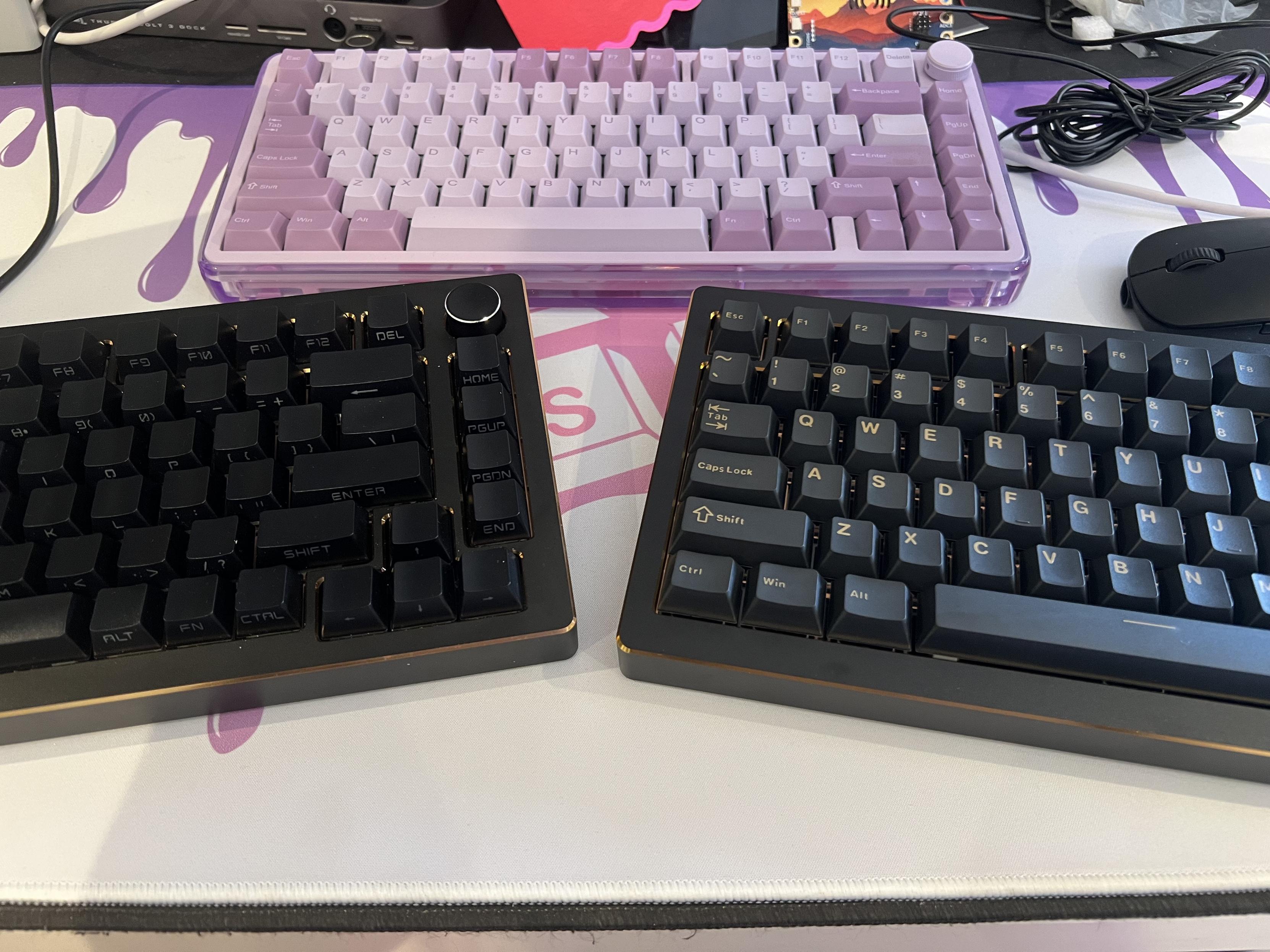
I now have two separate revisions of the Epomaker Tide 75 and would be remiss not to play spot the difference!
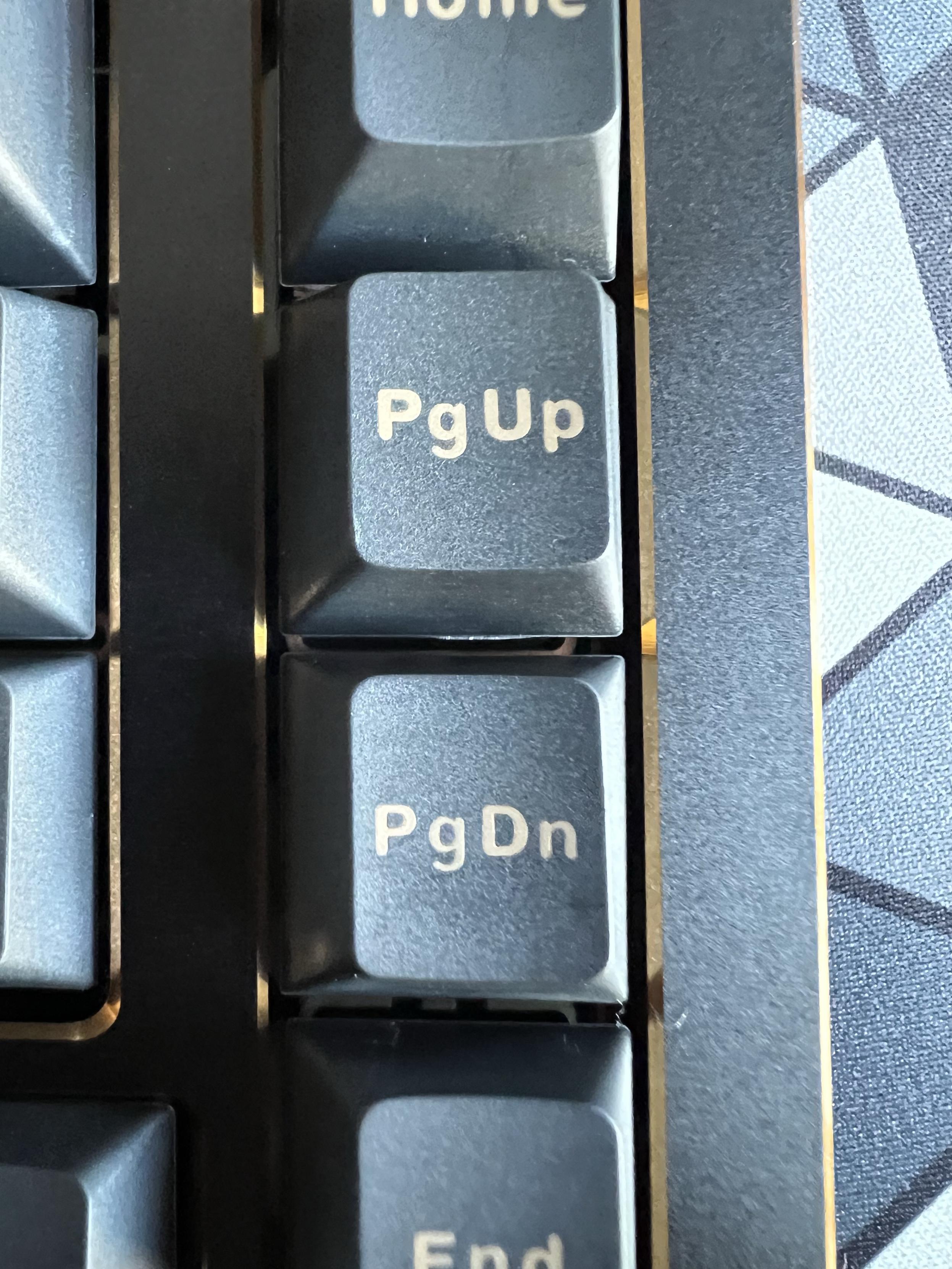
In an effort to provide a clean, sort-of minimalist look, on the original Tide 75 Epomaker (the side-printed version you’ll find on the store today) had moved the key legends from the top of the keys to the front. This isn’t uncommon or unusual but it’s an interesting choice. Unfortunately they haven’t got much better at picking fonts. The font choice has far too much of a “spray painted on the bulkhead of Red Dwarf” look about it, opting to be stocky and stencilled where something with a little more finesse is sorely needed. It lacks the softness that would complement the Blue, Purple and Pink Tide75 variants, and lacks the elegance that the Black and Gold demands. It certainly doesn’t help that R (in CTRL) and A (in ALT) look identical and yet there’s a very visually distinct “R” key. There’s no “A” in Control, Epomaker!?
Am I splitting hairs? Hell yes I am. Epomaker are very, very close to having something really good and I’m not going to half-bake my critique because I swear they actually listen.
And, you know what, perhaps they do. In the second Tide 75 iteration they sent me the legends had moved back to the top of the keys, and the font replaced with something softer but still not super great. I think this is the “top printed” variant of the Tide 75 and is definitely the one I prefer. Some alignment and font weight choices still look slightly off, and the doubleshot moulding process has led to that “newspaper cutout ransom note” effect where the size and weight of letters in the same word seems to vary widely. Nonetheless the change is largely for the better, and Epomaker’s choice of a dark blueish-grey has made the overall look of the black Tide 75 that touch nicer.
What’s acutely missing, however, is shine-through. The top-printed keycaps are opaque, making the backlight merely an underlight.
Interestingly, even to this day some say you can see the “CTAL” key in Epomaker’s product photography.
Teardown
I swear I’ll burn myself out meticulously taking apart every keyboard that comes my way, but at least the Tide 75 makes it easy.
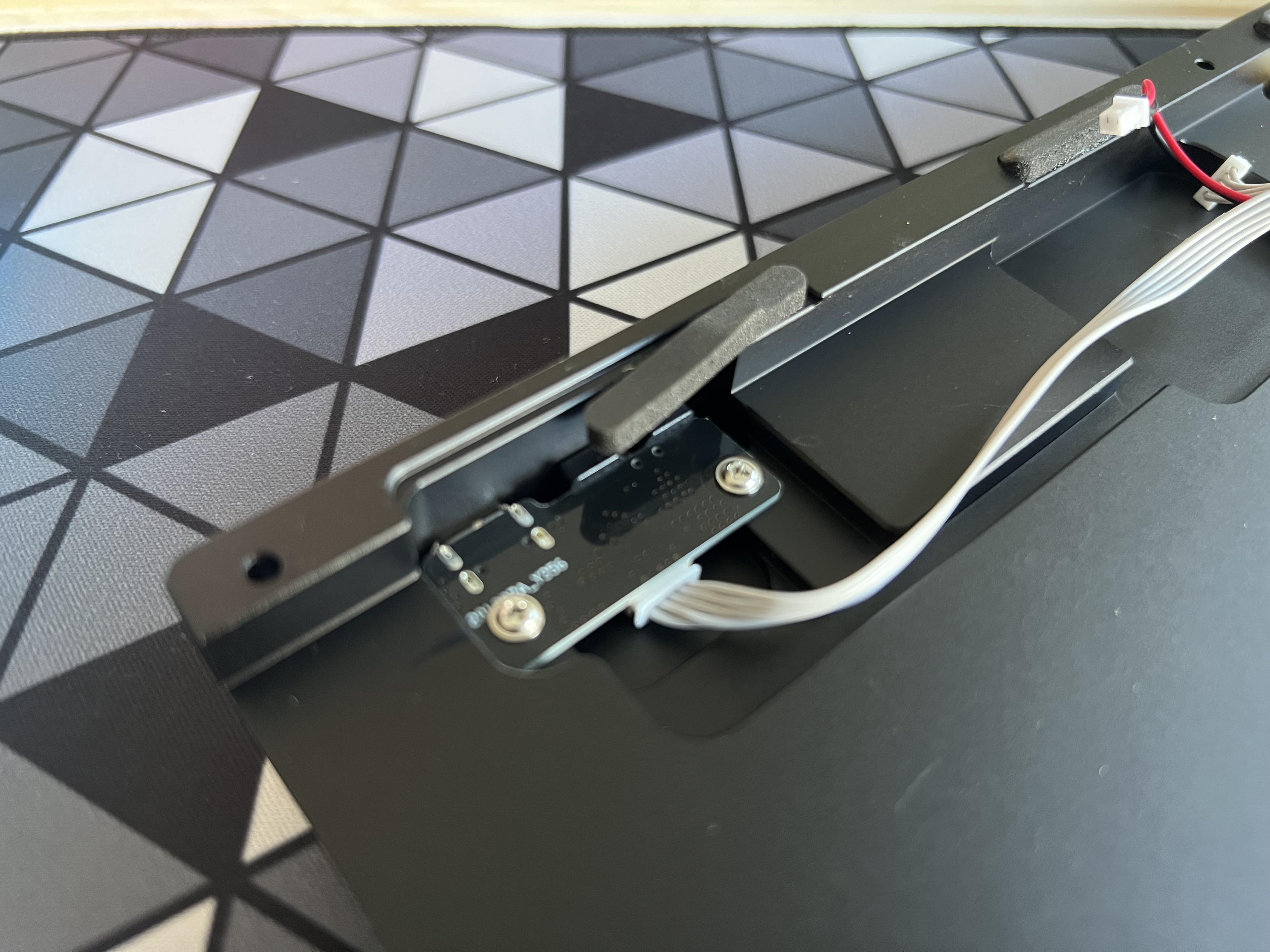
Inside the Tide 75 its less than perfect origins are laid bare, misaligned layers, misaligned components and the classic cheap ribbon-style connector between USB/switch PCB and main PCB are all obvious with just a cursory glance. Little has meaningfully changed between the two versions of Tide 75 that I tested in this respect.
I’m not sure what’s going on here…
The gasket mounted cantilever design of the PCB gives an ostensibly springy feel to the keybed, but doesn’t have quite the length or flex to really pull it off properly.
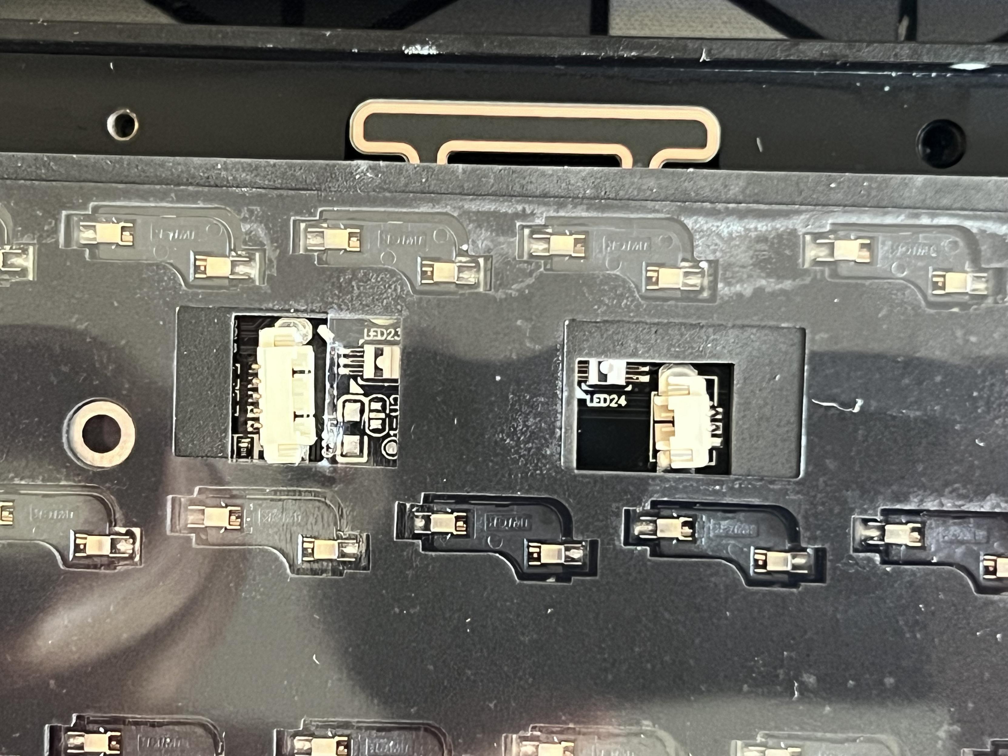
Go home JST, you’re drunk!
For the most part, however, everything is pretty routine. The same JST-connected battery offers the tantalising potential of repair and replacement and for the most part – wonky JST connectors notwithstanding – the main PCB seems fine.
Another QMK board, another round of drama!
I write FOSS by trade, and so I’m always going to bang the upstream-your-darn-code drum if I get the chance. I wrote a lot about the QMK situation when I reviewed Epomaker’s Shadow S and much of that applies here, too.
With the Tide65 and Tide75, however, Epomaker opted to raise pull-requests (that’s a request to get their contributed code merged into a project) to the QMK project in an effort to get their boards officially supported. These PRs, and – a little birdie tells me – efforts to work more closely with QMK’s maintainers are a great leap forward from the Shadow S situation, but there’s still a way for Epomaker to go.
In good faith, the Tide 65 board was merged into QMK, but it was only in hindsight that the QMK maintainers realised it didn’t include any code to actually get the wireless working. This means you can sort-of build new firmware for your Tide65 from source, but without some significant reverse-engineering effort you’re not going to have Bluetooth or 2.4GHz wireless support.
Keyboard code with no wireless is strictly against QMK’s policies (it’s a violation of their licence to ship a keyboard with code that’s not made available to customers under the same license terms), and so the Tide75 code is held in limbo until Epomaker can produce working wireless drivers. To be clear, QMK aren’t asking for the secret sauce firmware running on the wireless chip itself, or anything that couldn’t be reverse-engineered by a competent and sufficiently bored embedded programmer. They just want the code that communicates with the wireless chip and makes it actually usable.
Why is this important? Well if Epomaker ever EOL support for this keyboard, go out of business, or otherwise fail to fix a future bug or issue with the Tide65 or Tide75 then a complete, functional and fully-featured contribution to QMK means that- with perhaps a little guidance and gentle pointers- you could modify or update your keyboard without their involvement. This is especially important for something as complex as a QMK-based keyboard because it’s easy for bugs to slip through.
For instance, it was pointed out to me that the Tide 75 displays a minor bug with macOS where the caps-lock LED will stay active when switching between RF and Bluetooth profiles, even though caps-lock itself isn’t active. A minor bug, for sure, but with sourcecode available in QMK *anyone* could swing by, fix it, and submit their fix for inclusion in the shared codebase.
This isn’t the only benefit, though. In order for VIA – the keyboard configuration GUI – to include support for a particular keyboard, it must first be officially included in QMK. Without this crucial first step, Epomaker are doomed to asking customers to use a third-party clone of VIA, or side-load JSON files.
Suffice to say, Epomaker are on QMK’s public naughty list and I can’t in good conscience tell you how much I like this keyboard, without pointing how how it’s currently abusing the good faith of open-source projects, violating their licence and leveraging their branding and work as a headline feature.
Overall
Epomaker seem to be slowly but surely inching toward perfection. They still need to cough up those wireless drivers and play by QMK’s rules, but there’s at least some effort being made.
They also sorely need to step up their font game. While they replaced their ugly, stencil-style font with something a little softer, it’s still lacking in the finer details that you’ll appreciate from a decent set of keycaps. For the most part it looks fine, but if you’re artistically inclined and have any opinions about fonts it’ll bug you no end.
typesetting is my passion
Despite these flaws, the Tide 75 comes a close second to the Epomaker x Feker Galaxy 80 as my favourite keyboard from Epomaker yet. That’s saying a lot, since I really can’t emphasise enough how much I love the Galaxy 80. The gold chamfer on a beautiful black canvas is a large part of the reason the Tide 75 appeals to me, but certainly isn’t all it has going for it.
On the downside the Tide 75 is clearly built down to a price and hasn’t quite achieved the right balance of cost and quality yet. It’s close, but the wonky internal components are a little alarming and the keycaps sorely need the keen eye of a native-English graphic designer to give our gloriously crude 26-letter scrawlings the tender care they deserve.
It’s a great looking keyboard from a safe distance! Absolute prime candidate for a premium set of keycaps.
If you want a chonky aluminium thocky boi on a budget then add this to your short-list, but you should let me tell you about the KiiBOOM Breeze 75 and Loop 65 too!