Epomaker TH80 Pro V2 Review
If I could sum up the Epomaker TH80 Pro V2 VIA in a single sentence, it would be something like: “it’s ok, but I don’t love it.”
The TH80 Pro V2 captures an era that’s, perhaps, a little bit before my time. Its scooped keys and hulkling, boxy design are consistent with my distant memories of playing some maths Taxi game on the BBC micro. If you’re getting misty eyed at the thought of that, then maybe the TH80 Pro V2 is the keyboard for you. It’s not bad, by any stretch, but it just doesn’t excite me. Not like Epomakers Tide 75 or Galaxy 80, or KiiBOOM’s Breeze 75. It’s missing some aesthetic secret sauce, to really make me pay attention.
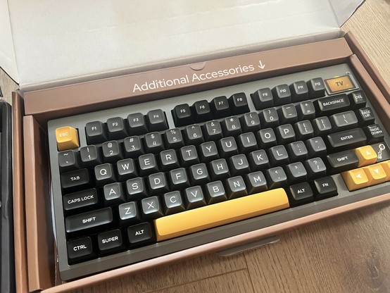
It’s rather telling I mostly have photos of the TH80 in its box. I didn’t clock many hours on it.
As such I’ve dragged my heels over this TH80 Pro V2 review as newer, shinier things pile upon my desk and I slowly wither in the heat. But that’s not fair, because it’s a competent keyboard – though it continues Epomaker’s trend of not quite playing ball with QMK and VIA – and if its vintage computing vibes pique your interest then you might want to consider it. I’d err toward a black Tide 75 instead, but each to their own.
I tested the Epomaker TH80 Pro V2 in Black with Epomaker’s “Mulan” switches.
Look ‘n’ Feel
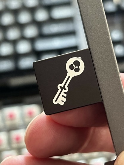
The TH80 Pro V2 follows Epomaker’s trend of keyboards that feel a little bit like they’re designed by a genetic algorithm. At first glance it’s pretty unassuming, but a tiny little key (as in, a key that opens a lock) icon is nestled between Page Down and the Right Arrow. This curio is a little magnetic whatsit that sits on top of the board and does… very little. Some research into the idiosyncrasies of artisan keyboards suggests it’s a “face plate.” A little branded knick-knack to add some subtle extra customisation. In the case of the TH80 Pro V2 you just get this one, weird key icon- a sort of vestigial remainder of the keyboard’s inspirations- with no way to replace or remove it.
Weren’t there enough keys on the keyboard already?
It feels wildly out of place and it wasn’t until I tried the Galaxy 80 – which has a similar little magnetic curio – that I realised why. Unlike the one on the Galaxy 80, which conceals a little USB dongle that pops up when you remove the magnetic cap, the TH80 Pro V2 … key thingy … hides nothing, does nothing, and mostly just looks a little off-piste. If you’re an enormous fan of Kingdom Hearts or Lockpicking Laywer perhaps it’ll appeal to you. But me? I… just don’t get it.
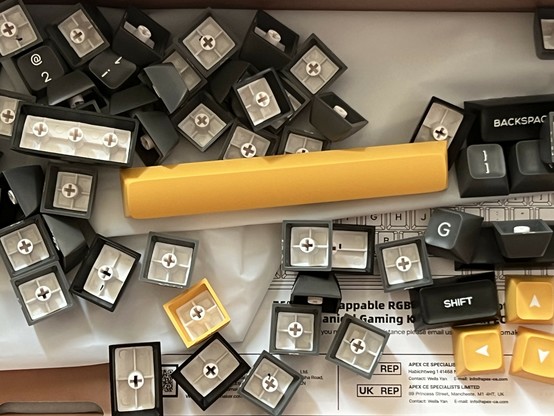
Aside from that the TH80 Pro V2 is visually unassuming, or it would be if it weren’t for the scooped keycaps. I think I’ve made no secret that I love KAM profile, and I love the weird, semi-low-profile, flat profile on the Galaxy 80, and I love low-profile Choc caps that are eye-wateringly expensive. I don’t love scooped keys, or maybe I don’t love these shiny scooped keys. They catch the light wrong, they’re too busy. To be fair, this is nothing you can’t see from Epomaker’s own product photography- if you love it, you’ll love it, if you hate it, you’ll hate it.
Keys keys keys. The yellow keys definitely look better but they don’t redeem the TH80 Pro V2 for me.
Offering some redemption are the yellow replacement arrow keys, space bar, enter and esc which make the TH80 pop a little.
Teardown
Getting inside the TH80 Pro V2 is unusually difficult for an Epomaker board. Considering the EK21-X came with an allen key to open it, the stubborn plastic clips the TH80 Pro V2 has to offer are awkward, albeit not too difficult to defeat with my battered iFixit spudger.
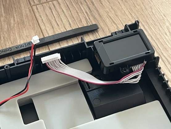
Inside is a pretty usual fare for an Epomaker board. Layers of padding and mechanical isolation between plate, PCB and outer casing. USB Type-C on a mechanically isolated daughter-board. JST-connected battery. And, rather unusually, a separate LCD module fully enclosed in its own plastic shell and connected via an IDE-style ribbon cable.
An LCD module in its own little enclosure with a ribbon cable to the main PCB, interesting!
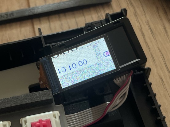
I whipped the LCD out of the Shadow S and connected it into the TH80 Pro 2 to see how much inter-board part compatibility there might be. It worked. Sort of.
Will the LCD from the Shadow S work in the TH80 Pro? … sort of 🤣
Most of these SPI LCDs are pretty much for muchness, but require a subtly different arrangement of bytes, or a different init sequence. It’s possible to fully remove and identify the LCD, and find parts online though so the TH80 Pro V2 is at least quite repairable in theory.
Software
I wrote a great deal about Epomaker’s approach to QMK and VIA in my behemoth of a Shadow S review.
The TLDR is that Epomaker use QMK – an open-source firmware for macro keyboards – and VIA – a tool that enables users to create macros, re-bind keys and more with their QMK keyboard. They play about as little ball as they can get away with when engaging with these respective projects, but their efforts do appear to constitute at least trying.
You should be able to grab the source-code of QMK and build your own firmware. You can’t. You should be able to rely on VIA knowing what the TH80 Pro V2 is. Without side-loading a config file- a tedious process at best- you can’t. This isn’t to say that the software doesn’t work, with some fiddling you’ll be re-binding your keyboard in no time, but it just isn’t quite where it should, or could be.
Overall
The result is, quite simply, a board that I neither love nor hate, though I recognise in it a certain nostalgia allure for an era of which I have only the dimmest recollection.
If you look at the TH80 Pro V2 and see something you like, it’s not a bad starter mechanical keyboard. As a reasonable approximation of a 1980s home computer keyboard, it’s definitely got the potential to kick you right in the nostalgias.
