ScanWatch 2 – What’s new?
Released back in 2020, ScanWatch built upon Withings’ existing health tracker lineup, following the Steel HR (from 2017) and the Pulse HR (from 2018). ScanWatch 2, announced September 2023 and now nestled against my wrist as I write this article, has now joined the fray. With a three year gap between the two – a refreshing change with the pace of technology being so dizzyingly fast these days – you might expect big things from this successor. And you’d be right.
But ScanWatch 2 feels like more of an evolutionary change than a revolutionary one. If you swap out your original – which is still part of Withing’s lineup – you might notice the significant visual overhaul from its predecessor. But otherwise? – there’s no groundbreaking, must-upgrade change. And that’s a good thing.
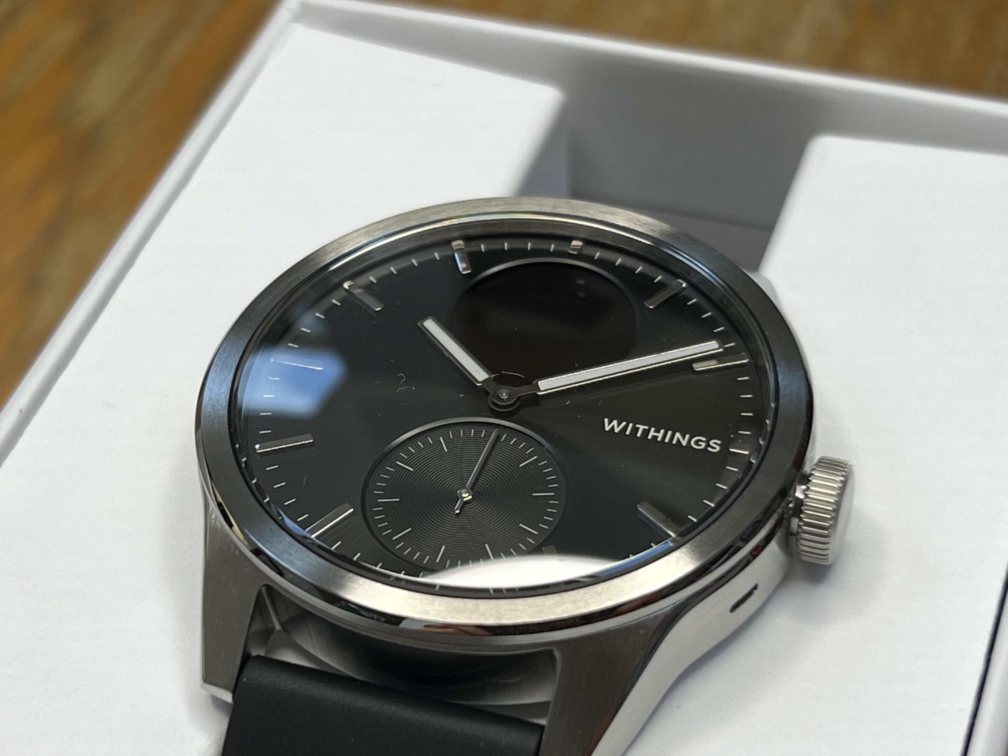
The watch body, at a glance, looks similar to the original ScanWatch but upon closer inspection it’s cut with much more angular, harsher lines. The stainless steel around the face is squared off, the sticky-out-bits for the straps are slightly bulkier and more angular, and the crown nestles in more closely and is just a hair thinner.
Despite the visual overhaul, there’s some confusion in the specifications about weight. The original ScanWatch is quoted as weighing in at a whopping 83g without the strap, and the ScanWatch 2 at a comparatively svelte 52.6g. There are plenty of reviews (not mine, thankfully) also citing that 83g weight for ScanWatch, and taking the specs at face value. My good-enough-for-cookies kitchen scales would like to disagree. The ScanWatch weighs about 52-54g, and the ScanWatch 2 is much for muchness. I did a little weigh-them-both, weigh one, weigh the other shuffle to be truly sure of this. If you want a lighter, 42mm watch then ScanWatch 2 isn’t it.
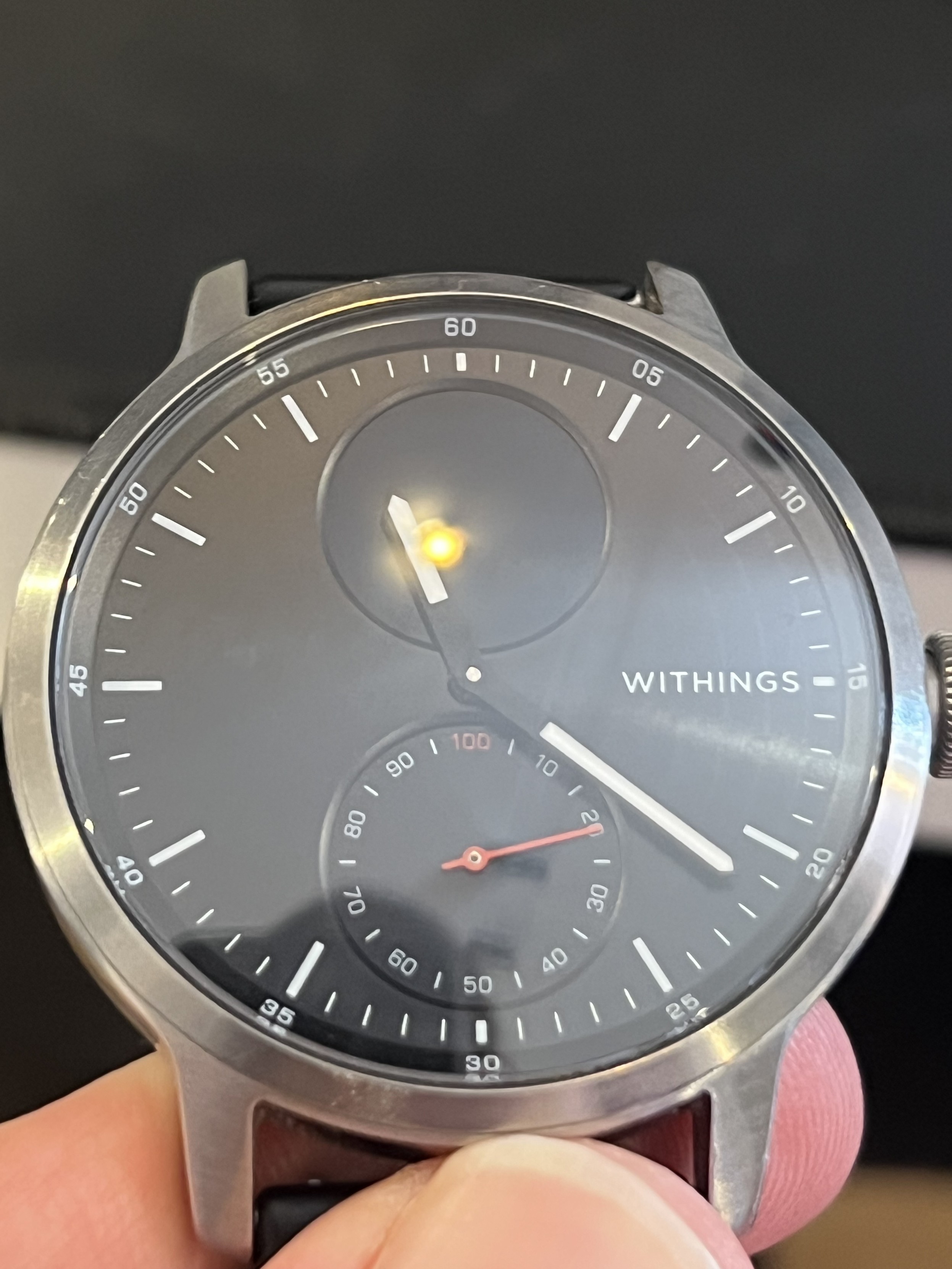
I wasn’t expecting such a huge redesign of the face between ScanWatch 1 and 2, but the new ScanWatch is much, much cleaner and feels a little more premium, even though the dainty hands have been lost to chunky bars and the contrast of the steel hour and minute marks isn’t as good as the old white markings. I’d kinda like the old hands back. The casing has also been squared off around the face.
That kerfuffle aside, ScanWatch 2 is a beautifully refined appeal to minimalism. Or at least a close approximation therein. Gone are the numbers on the hour markers around the dials, and similarly the 10% intervals on the activity tracker complication have vamoused. The white, hour marks are now picked out in raised, stainless steel to match the watch body- a change I’m very much warming to- and the minute interval markers have been knocked-back such that they disappear in low light. The activity tracker complication swaps out its red hand for a stainless steel one, and its face is picked out with a subtle concentric circular texture affording it a “premium” feel.
The hour and minute hands have joined the body in a chunky, angular update. Gone are the svelte, pointy hands of the original, and in their place are stainless steel edged, square slabs. They feel out of place juxtaposed with the minimalist overhaul of the watch face, and it feels like they’re reaching into ScanWatch Horizon territory. I’m going to use the m word and say this watch has been made just a shade more “manly.” With ScanWatch Lite offering a very particular set of features that may happen to coincide with the stereotypical needs of one particular gender, it’s clear Withing’s are playing to the marketing tropes across their range. It’s fine. I’ve got used to a big-ish watch now.
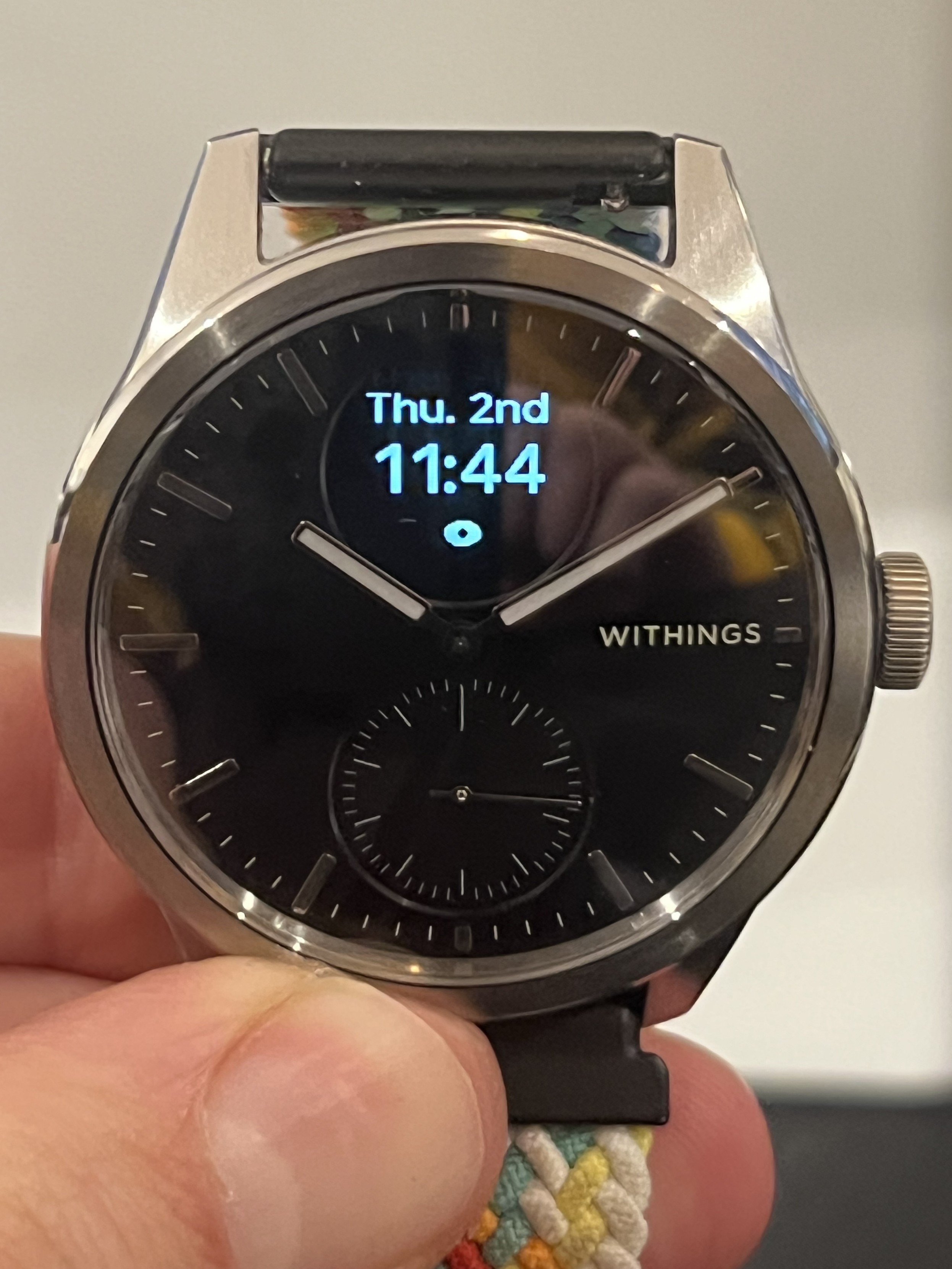
Bigger changes still come with the OLED display. It remains the same size and shape but is ever so slightly warmer and offers a marginal bump from 262ppi up to 282ppi. This sounds small but that extra density is put to good use with a thorough overhaul of the UI, touching everything from fonts, to layout to UX. As with the original ScanWatch this display is actually rectangular, shows a “letterbox” effect at the top and bottom, and potentially cropped horizontally. The letterbox is only visible when scrolling menus vertically, where it’s briefly very obvious that the display does not occupy the full vertical height of the circular region set out for it. This leads me to speculate that it’s a 156×96 pixel or similar display, but I have not managed to trace the part and the FCC documents (at least I’m extrapolating from the codename of the original ScanWatch) that might give me an inkling of a clue are confidential until the end of January 2024.
The new OLED also supports 16bit grayscale which – to the binary uninitiated – suggests it’s capable of displaying 65,535 shades of grey. I am, therefore, wondering if the specs meant “16-level greyscale” which is a modest 16 shades of grey or 4bit. That’s a difference between a 30k screen framebuffer, and somewhere around 7k.
The ScanWatch 2 makes use of its slightly higher screen density and 16-step greyscale
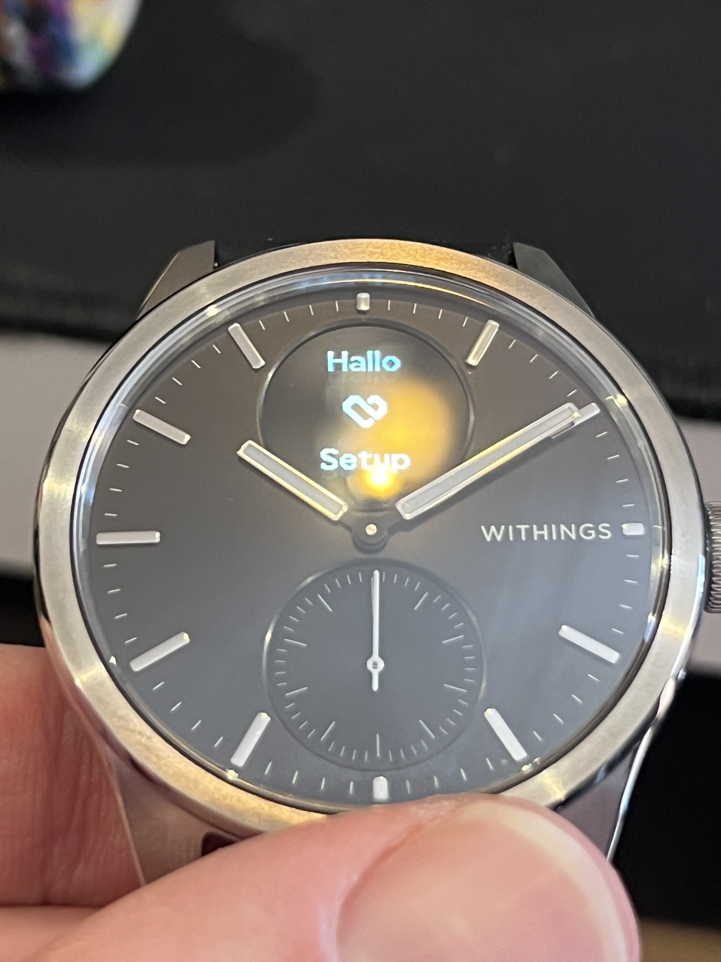
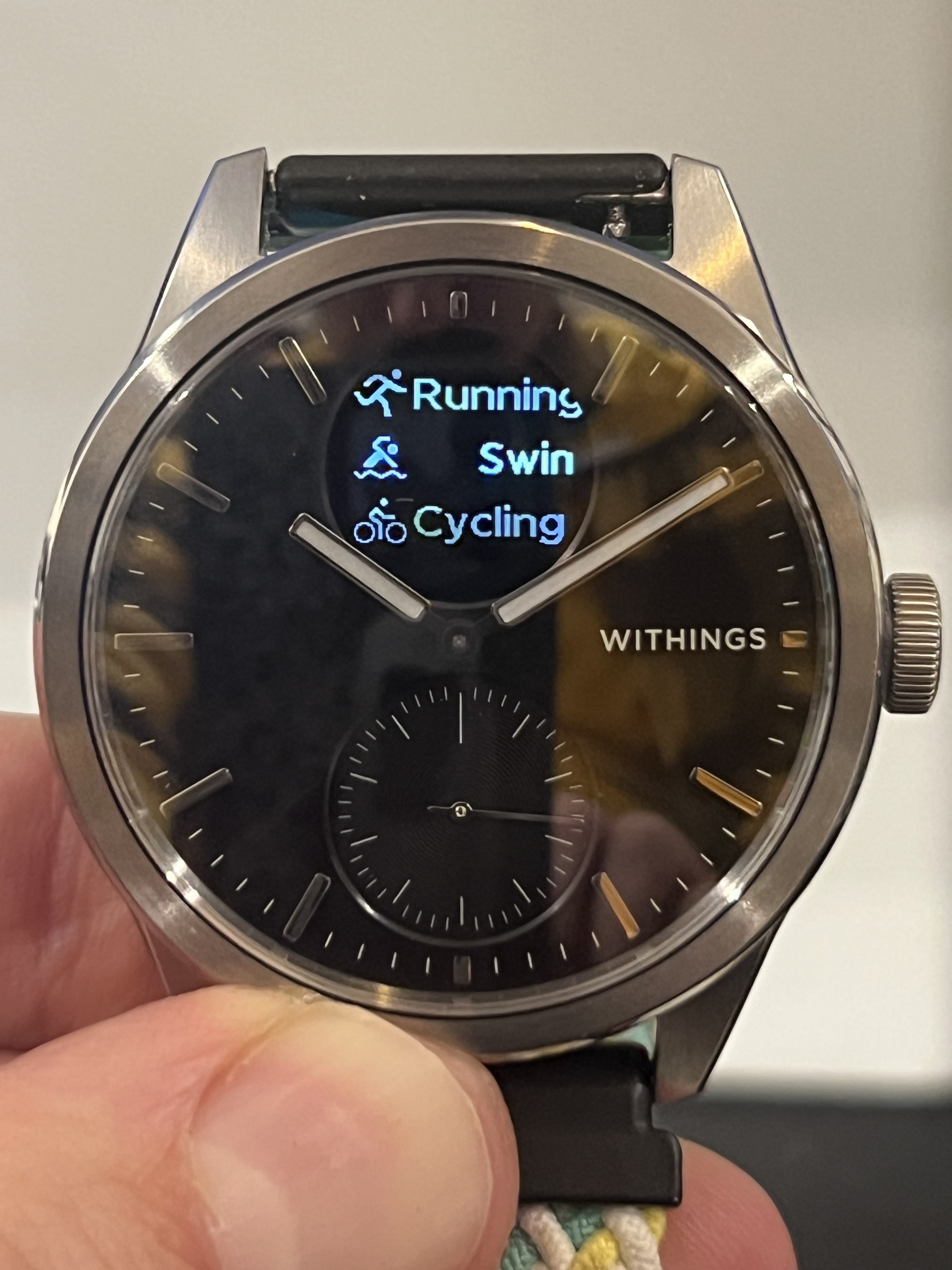
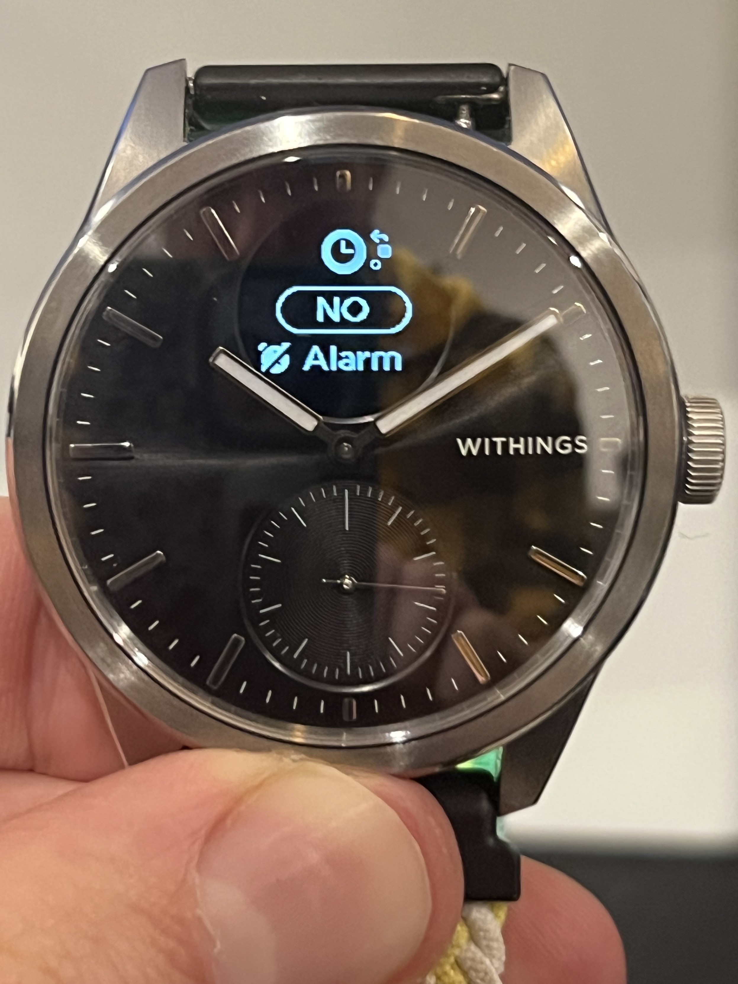
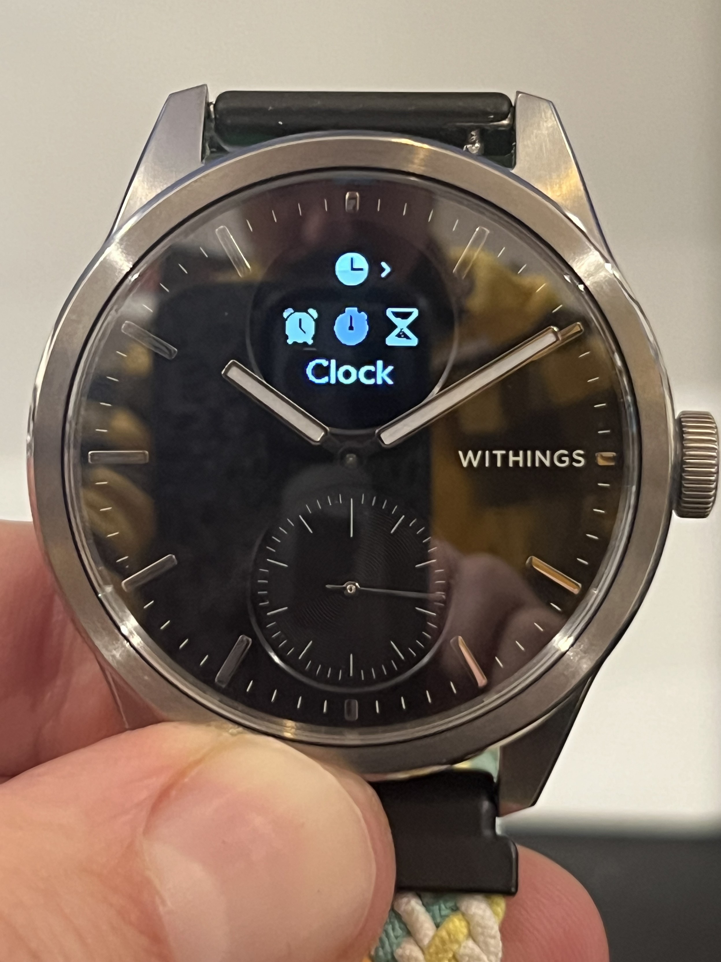
The new UI feels cluttered in comparison to the original ScanWatch. There seem to be smaller fonts abound, possibly making use of anti-aliasing to allow for more curvy fonts to look good on the tiny screen. In many places, smaller text gives way to additional icons, flashy spinner icons, pulsing icons and even – thanks to shades of grey making it possible to indicate unselected items – screens with multiple options in view at once.
The latter is most notable in the “Workout” menu. Gone are the individual screens showing an activity icon and static or scrolling uppercase text. Now there’s a glanceable menu with three options up on screen represented with scan-readable sentence-cased fonts. No more shouty caps! Unfortunately this is marred somewhat by the menu scrolling being a little hit and miss on these screens, but I’m confident a firmware update will fix that if it’s not just a me problem.
Other screens – such as Clock or Settings – have a brief summary of available options and their status. When you click through they’ll also show a little minimap style icon indicating your approximate location in the sub menu. It takes up a fair chunk of the screen, though, and I’m not sure I’m totally onboard with the changes just yet.
Noticeably gone is the tiny bouncy “press the crown” hint that appeared on the right-hand edge of some of the screens. Instead, options with sub-menus are indicated by a little right-chevron next to their icon. As such some of this feels like change for change’s sake, but as a programmer I’d probably also be happy to throw away a three year legacy UI and write my own.
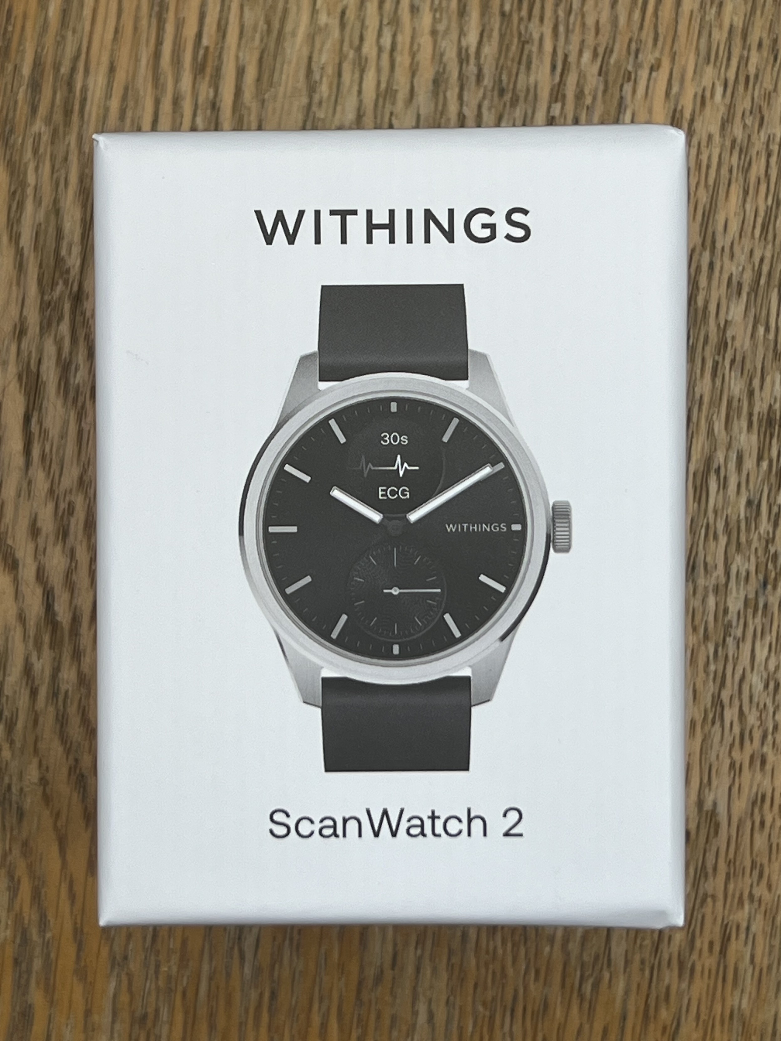
The packaging has undergone an overhaul to a more traditional (I think) watch box.
The packaging has also undergone an overhaul. The bulky, flat box that housed the original ScanWatch in its soft, felt pouch has given way to a more traditional, squat, almost cube-shaped watch box. It’s good enough that you might be happy to keep it around as a place to store ScanWatch if you have a couple of watches in rotation.
Charging has also changed. Perhaps for the better in some respects. In lieu of the original locating hole and gold contacts on the bottom of ScanWatch, ScanWatch 2 uses the watch body and crown as the terminals for battery charging. The crown takes +5v and the body is ground.
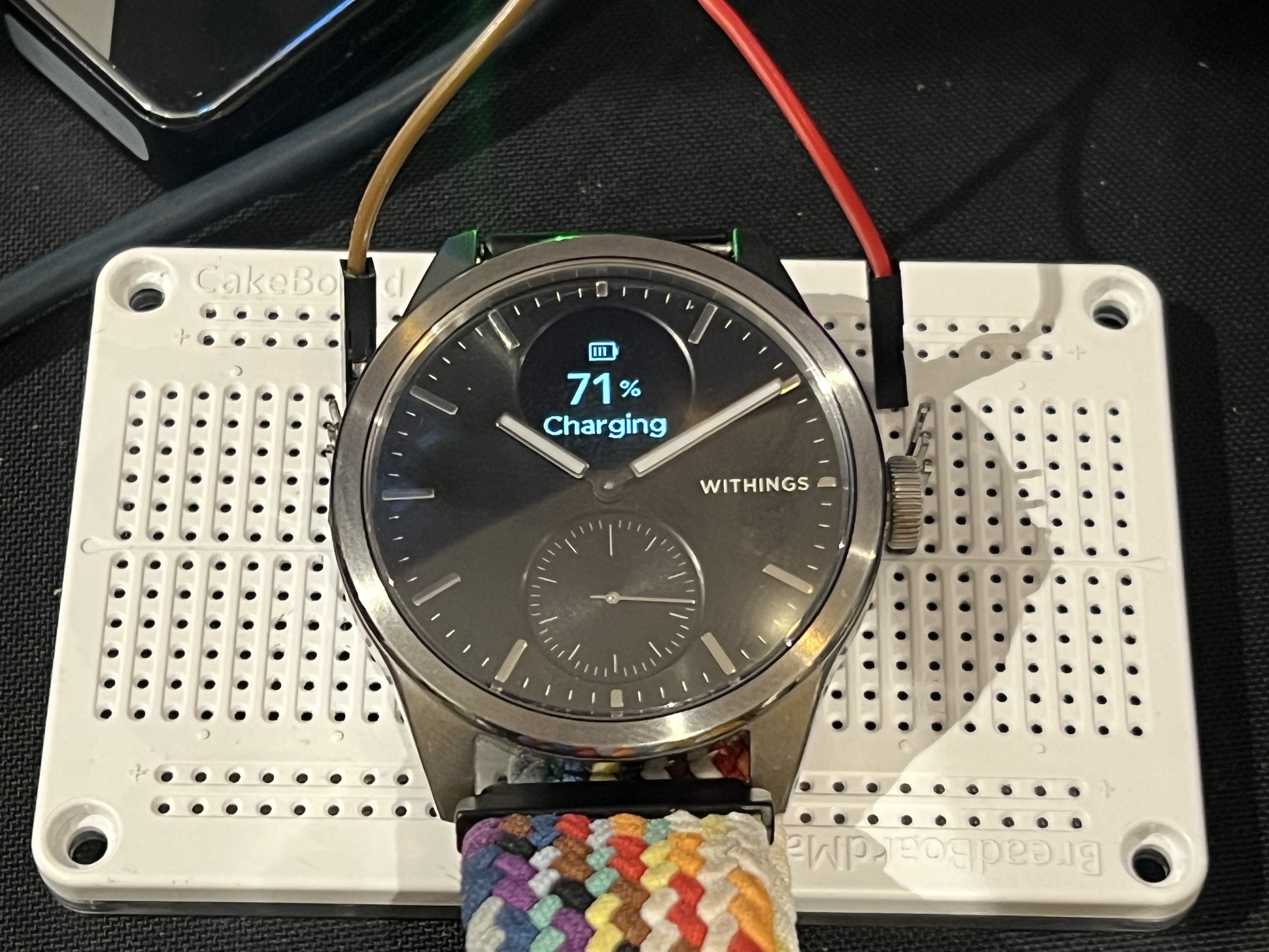
Since Withings moved the charging contacts on the ScanWatch 2 from copper pads underneath, to the Watch body and crown… I figured I’d see what passing 5v through it does…
This is wonderfully clever in theory, but in principle requires a quite thoroughly horrible, spring-loaded, finger-trapping charging clip that clamps over the watch and crown to make a reliable electrical contact. This palaver feels like a significant step backward from the elegant magnetic snap needed to pop the original onto its charger. Charging is a once-every-thirty-days (roughly) activity, though so it’s not easy to form a regular habit around. More often than not I forget and might be rushing out of the door with a low battery warning flashing away. With this in mind perhaps having a charger that clamps securely onto the watch for charging on the go is a positive thing, even if it feels janky.
A worthwhile upgrade? If the temperature monitoring piques your interest and you want a refreshed look in your watch, I wouldn’t blame you for being tempted. If you’re new to ScanWatch this is probably the one to get. The refined look really brings the range to a whole new level. If you’re upgrading then you shouldn’t have FOMO just yet.
Ignoring Horizon, ScanWatch 2 is still top dog in a stellar watch lineup that starts with Pulse HR, which is still available for sale and fills in the low-end of Withing’s analog-watch styled health tracker range at just £170, and runs through ScanWatch Lite at £230 and the original ScanWatch at £280.