TicWatch Pro 5 Enduro Reviewed
I loved the TicWatch Pro 3 Ultra. However it was overshadowed by my disappointment at its promised, but overdue, WearOS 3.x update. For the TicWatch Pro 5, Mobvoi have simply jumped the gun- with a super secret, NDA-protected, private beta for a WearOS 4 upgrade. Knowing that everything I have to say about the TicWatch Pro 5 may, therefore, be obsolete, I’m going to focus less on software and more on the watch itself, and how it’s changed from the previous iteration in – mostly – good ways.
In this review I’ll be talking about the TicWatch Pro 5 “Enduro” rather than the original Pro 5. This revision promises a slightly better battery life than the vanilla Pro 5 and includes sapphire glass, but is otherwise much for muchness. It appears to replace the Pro 5’s £329.99 price point, with the Pro 5 dropping (at time of writing) to £244.99.
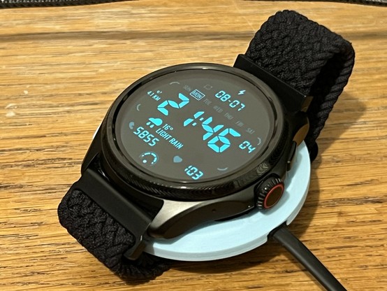
NGL the new clean black look with the uh… borrowed? … red crown detail is ace. Though the fabric strap is my own aftermarket swap.
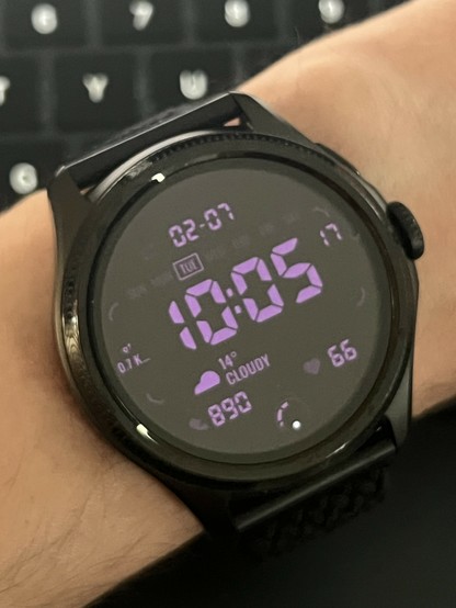
Visually the Pro 5 is an evolution of the Pro 3 – the most obvious differences being the single crown-style button in the middle, and a more minimal auxiliary button replacing the previous second crown. The crown still rotates, but now that rotation The minute delimiters have also been removed from around the watch face, for a sleeker look that works better with digital style clocks.
Internally the Pro 5 bumps up from the Snapdragon Wear 4100 to the W5+ Gen 1. This includes a doubling of RAM from 1GB to 2GB (sheesh it’s bonkers to think of that much RAM in a watch) and a quadrupling of flash storage from 8GB to 32GB. In real terms this makes for a watch that feels significantly snappier than its predecessor.
Unfortunately Google Assistant is the first casualty of this upgrade, with built-in assistant functionality being unavailable on the new watch. It’s possible to sort-of fudge it in using an old version of Google Assistant, but – while it works – the experience is less than smooth.
A slight bump in battery capacity, in addition to the more efficient chip, has seen claimed battery life rise from 72 hours to 80 hours on the Pro 5, and 90 on the Pro 5 Enduro.
The screen has bumped slightly from 1.4” to 1.43”, with an imperceptible bump in resolution from 454×454 pixels to 466×466. This makes the watch slightly larger, and heavier, though it’s also .1mm thinner. The strap size has also bumped from 22mm to 24mm, which caught me out when I ordered a replacement nylon strap (silicone is not compatible with my skin, apparently) but aftermarket straps are still readily available.
I am fully acclimatised to 3D printing solutions to all my problems now 🤣
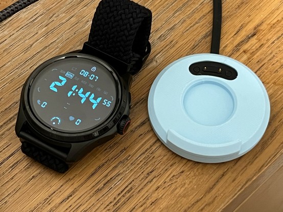
The charger is still a weird little nubbin providing a power-only connection but there are aftermarket charging stands available to make something that stays put on your bedside table. I just 3D printed (I finally picked up a 3D printer and it’s awesome) a little puck to give it a little more bulk.
Low power. Nostalgic, digital display.
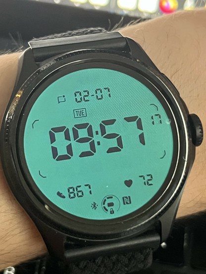
Like its predecessor the TicWatch Pro 5 Enduro includes an ultra-low power FSTN display, a low-fidelity seven-segment style display reminiscent of those fixed-pattern displays in Casio watches or vintage electronic games. (Gosh my childhood is vintage now!)
The FSTN display is, far and above, the biggest draw to TicWatch for me. It offers a glanceable time without having to fire up the full force of WearOS and you can even disable WearOS altogether in Essentials mode where the FSTN display takes center stage.
It’s only fitting, then, that since the Pro 3 Ultra Mobvoi have given the FSTN display a little more love and attention. Part of this is enabled by the new rolling crown which, in low power mode, will allow you to switch between Heart Rate, Calories Burned, Blood Oxygen, Compass Heading and the standard date/time view. Most of these modes take a few seconds to perform a reading, since Heart Rate and Blood Oxygen are measured on demand, but it’s still quicker than firing up the watch and swiping through to the TicHealth app.
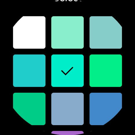
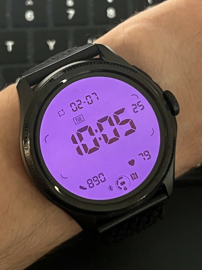
You get a palette of pre-defined colours from which you can choose the FSTN "backlight." Since it uses the OLED display it can in theory be any colour, but it's fair to say blue-green is the correct choice.
As before a flick of the wrist will fire up the FSTN backlight which you may be surprised to learn is simply the watch’s OLED display lit with a solid colour. This means that, while classic blue/green is absolutely the one true correct colour, you can pick from 18 pre-defined backlight colours. Half of these are appropriately blue/green ish but there are also some yellows and a vibrant red if you want to evoke a vintage digital SEIKO.
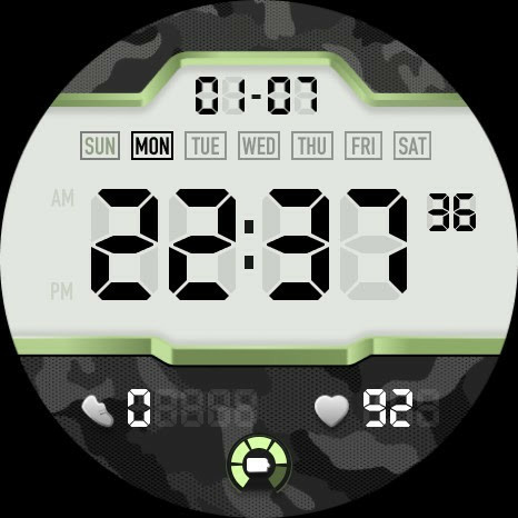
The manufacturer supplied watch face - intended to match the FSTN display - is tragically ugly. It doesn't even match the Pro 5 Enduro and clearly alludes to the old Pro 3.
Among the embarrassment of WearOS watch faces that come with the watch is one called TN OLED which matches the style of the TN display somewhat and offers some continuity between the watch modes. Unfortunately this watch face is U. G. L. Y, suffering from a little too much… well, just too much. Where a close 1:1 recreation of the FSTN display would have tied Essentials Mode and WearOS together nicely, the TN OLED watch instead face brings out the pseudo 3D drop shadow’s of the 2010s, looks needlessly busy and offers no customisation options.
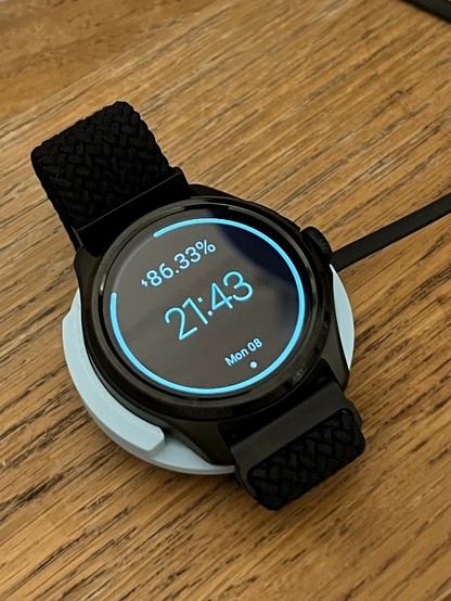
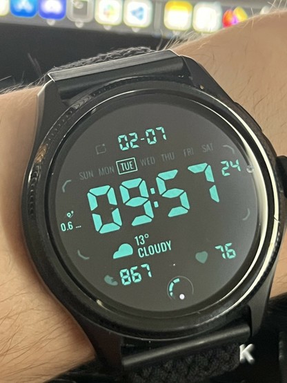
Entirely by accident while writing this review I stumbled upon the “Pro 5 Essential” watch face which is about the best £2.99 upgrade you could make to a TicWatch Pro 5 or Pro 5 Enduro. I’ll keep it brief because, well, this is a TicWatch review and not a Duncan Wick Design review but this face offers an incredibly faithful recreation of the FSTN display complete with customisable text and background colours. I opted for a blue/green text on black background inversion of my FTSN display, playing to the strengths of the OLED while keeping that gorgeous classic backlit digital watch look. Honestly 10/10 for this watch face. It should have shipped with the TicWatch.
If these two images don’t sell you on a TicWatch Pro 5 Enduro then I don’t know what will!
Anyway I digress, the always-on glanceability of the TicWatch Pro 5 Enduro – owed completely to its unusual FSTN/OLED hybrid display – has made its absence from my wrist very, very noticeable when I inevitably somehow still manage to let the battery run down and have to charge it…
How to cheat at battery life
Not to bury the lede, in real-world testing with the TicWatch Pro 5 Enduro I was getting somewhere between 4 and 5 days of battery life. This endurance is a double-edge sword of sorts. While I appreciate having to think less about charging the watch, I also think less about charging the watch- this inevitably leaves me running completely out of battery on occasion. A good habit would be to charge every Monday and Friday during breakfast, perhaps, but I’m not good at forming habits. Fortunately TicWatch Pro 5 charges pretty quickly, with a 30 minute charge ( as claimed ) netting around 60% ( as claimed ) for two or so days of runtime. At least if you’re not using the watch to listen to podcasts… uh… it’s actually pretty good at that.
Wrist flicking is just as responsive at turning the backlight off as it is on, too, and I notice the Pro 5 backlight brightness – on my wrist side by side with the Pro 3 – is noticeably dimmer in any given situation, but not uncomfortably slow. Mobvoi have really put the legwork in for battery optimisation and it shows.
Maybe these will…
TicWatch’s real strength is, however, simply cheating at battery longevity. For night-time use, when you’re asleep and not using the smart functions, the watch has a default schedule which switches it into Essentials Mode. Sleep monitoring still works, which you’d kinda expect, but the “Tilt To Wake Backlight” is disabled so your watch won’t eat battery while you move in your sleep.
This is a great energy saving feature which probably has the biggest impact on the TicWatch’s battery life- since it’s effectively turning it all but off for half of the day. It’s not without its flaws, however. Waking from “Essentials Mode” (when you first try to turn the watch on in the morning) will greet you with a “Welcome Back From Essentials Mode” message that sticks around for a few seconds while the watch – presumably – does a warm boot. This is tolerable, but slightly annoying when I’m trying to assess my sleep in the morning.
But that leads me onto another great thing about the TicWatch over my long-time favourite deliberately-not-very-smart ScanWatch- you can assess your sleep on the watch itself, and more besides-
Smart features I actually use
It’s taken a long time for smart features to eke their way into my daily routine, but the TicWatch Pro 5 Enduro has made the most headway so far.
Perhaps a large part of the reason why is the ease of access that the rolling crown provides. It’s a simple UX change over the TicWatch Pro 3, but it counts for a lot. Instead of poking at the screen with a finger to scroll through health and sleep reports, I can now gently roll the crown, avoiding obscuring the screen, avoiding extra finger smudges and precisely scrolling through information at my own pace. This was one of my biggest bugbears with the Pro 3, and it’s great to see it almost fixed. Almost.
Similarly the crown offers smooth, precise zooming in Google maps which isn’t all that useful in practice but is rather impressive to see on a watch.
I’d love to be able to press the crown to select things, but unfortunately it will always return me back to the watch face. As far as I can tell this is a limitation of WearOS and not unique to TicWatch.
Even the sleep overview is pretty decent. Though the smart money would be to get a little last-N-hours-of-sleep bargraph on the FSTN display 😆
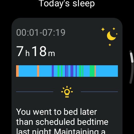
Nonetheless I’ve been using the TicWatch to check on my sleep quality, which is straight-forward with a crown push and a couple of swipes to access the TicHealth app. If you don’t know what to expect from sleep tracking, the app displays an overview – start, end, total time and a striped bar with a detailed breakdown of your sleep phases. Tapping this bar explodes it vertically, giving a positionally cued (excellent for those with colour vision issues) graph of sleep quality where the top-most bars are awake, and the bottom are deep sleep. A quick roll of the crown will scroll down to a summary of these, giving total time awake, and in REM, Light and Deep Sleep.
The level of sleep information I can flip through *on the watch* is pretty great. Saves melting my eyeballs out with the phone screen first thing in the morning.
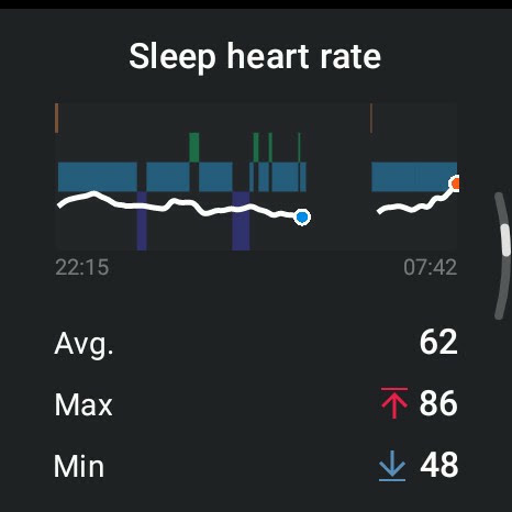
Roll even further and you get an overlay showing heart-rate on top of your sleep stages. I can, for example, see my heart-rate peak exactly when I woke up from a bizarre, stressful dream about – I kid you not – hunting for a way to beat alien invaders on an inhospitable ice planet.
As if that isn’t information overload enough, graphs of Blood Oxygen, Sleep Respiratory Rate and Skin Temperature follow, but are not overlaid over the sleep phases so they’re much less useful for correlating with particular disturbances or poor sleep.
Somewhat surprisingly the sleep view on the watch is actually a notch better than that in the companion Mobvoi Health app. The app provides much for muchness the same information, but heart rate is not overlaid over sleep phases so there’s almost no point glancing at your phone. Perhaps the way things should be.
In addition to health data I find myself consulting the weather often. Again it’s just a crown press and a swipe away, though it can also be added as a “complication” (a small additional widget showing some tertiary information) to many watch faces.
I also grabbed Wear Casts, an app which allows you to listen to podcasts directly on the watch. The Pro 5 Enduro’s speaker is pretty phenomenal, and I use it to play kid’s bedtime stories in lieu of my phone.
Other Bits ‘n’ Bobs
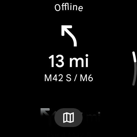
I spent a lot of time tinkering with the Pro 3 on WearOS 3, which I still have (I tend to keep stuff around for exactly this kind of reason) and really, really feel a very noticeable difference in speed and responsiveness between the Pro 5 (which is faster, I should clarify) and the Pro 3. In addition to this the Pro 5 seemed much more capable with apps like Wear Casts, connecting to WiFi (at the cost of battery life, mind) and streaming podcasts with no issues whatsoever. Similarly the GPS seems much better at getting a fix, making the weather app more consistently useful and even giving me GPS driving directions for a full drive to Maker Central, with the paired Android phone left at home.
WearOS 4
The TicWatch Pro 5 Enduro seemed to fare much better with GPS than the Pro 3. I took it on the road, leaving the paired phone at home.
With Wear OS 3 being such a point of contention for the TicWatch Pro 3 Ultra I remain apprehensive about WearOS 4 and would suggest you don’t count on its arrival anytime soon. That said, the Pro 5 Enduro is – lack of voice assistant notwithstanding – in a great place with a responsive UI, great battery life and enough apps/watch faces to make the smarts a useful, everyday feature. WearOS 4 promises better battery efficiency, though there’s no telling how big an impact that will have on Pro 5 which spends as little time actually running WearOS as it can get away with.
Smart features I don’t use… yet
Exercise remains the huge elephant in the room every time I test a smartwatch. I don’t do much. The TicWatch has been predictably great at tracking steps, but was also prone to picking up my unusual bouts of activity as actual exercise. I’m sure this is much more useful for people who do exercise, but I found that nipping through the Health app and disabling all the exercise types it will auto-detect prevented this.
That said, I took the Pro 5 Enduro swimming and had to re-enable the Swimming option while in the pool. Somehow it eschewed the usual disaster that results from combining water and touchscreens and I had no trouble whatsoever navigating the watch. Once I started a swim, however, it locked out the touchscreen to avoid any problems. When I ended the swim it automatically ran the water ejection routine- I had to do it again manually, since I exited via the pool showers. Regrettably I was again not actually exercising, it was a family swim, so I don’t have much useful commentary to venture regarding this feature. Other than, of course, that it works and watch is no the worse for wear after a trip in the pool
Foreshadowing....
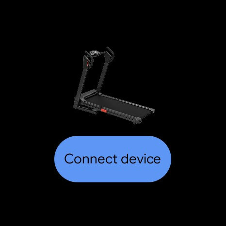
Mobvoi have sent me a treadmill to try out, though, so my dangerously lazy habits must be broken to fulfil my literary obligations. Stay tuned to find out if I overdid it and had to lie down for a day… again…
Overall
The Pro 5 Enduro is exactly the “improved Wear OS 3.x successor” I hypothesised about when testing the Pro 3. The rolling crown as an input method is almost every bit as excellent as I’d hoped, falling short only with WearOS’s refusal to use it as a select button too. Better battery life, a more responsive UI, a more useful set of low-power/Essentials mode display features, seemingly better network performance, better GPS performance and a refined visual design really come together in a watch that I would not hesitate to recommend – lack of voice assistant, once again, notwithstanding – and haven’t hesitated to wear daily.
All this, of course, is underlined by the fact that Mobvoi’s signature, low power TN display – a very pragmatic feature – is perhaps the epitome of form follows function. It’s so effortlessly nostalgic, beautifully clean and to the point, and so perfectly complemented by the (third party, unfortunately) Pro 5 Essentials watch face that I could forgive a lot of sins before I’d found the TicWatch wanting.
It helps that I prefer digital watch faces and never really mastered the knack of reading analog ones at a glance…
